Rust-Oleum
100th Anniversary Logo
Project Overview
Various projects were created to celebrate the 100th anniversary of the company's founding, starting with a commemorative logo and moving on to special merch items for employees.
Final Logo
The final logo with color, gradients, and shadows will be displayed throughout the year in printed pieces, company presentations, and more. A flattened, single-color version was also created to allow the logo to be embroidered in apparel, screenprinted, etched in glass, and more.
Iterations
Several unique versions of the logo were created to provide options and hone-in on the ideal design for the company.
Commemorative Spray Can
Project Overview
With spray paint being a large part of the company's product offering, every employee was given a spray can with a special label design as part of the year-long 100th anniversary celebration. These labels were designed to give the employees a unique gift that celebrates their hardwork as well as the past, present, and future of the company—all while serving as an art piece for display in their workspaces.
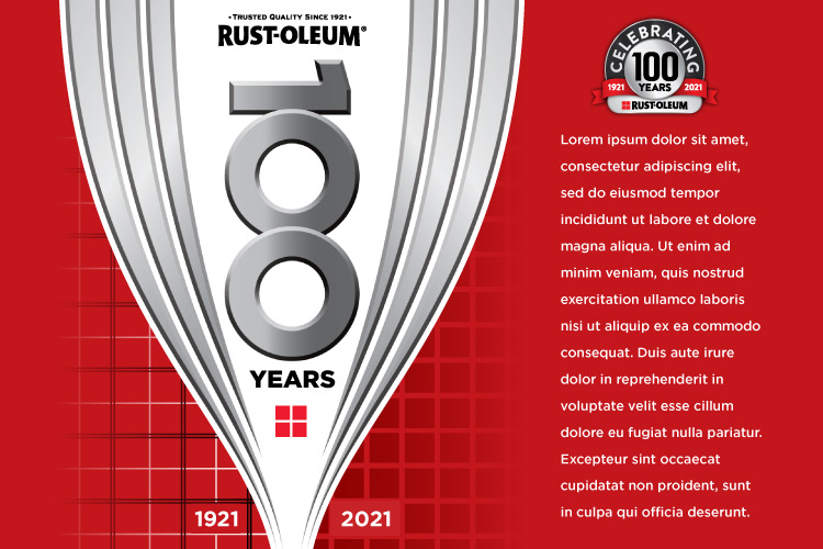
Label Design
This label features "swoops" that represent both the spray pattern of a paint can, as well as the hull of a ship—a nod to the origin of the company, which began by creating rust-preventative paint for ships. Additionally, the company's original plaid pattern is found on the 1921 side, and the current plaid pattern is shown on the 2021.
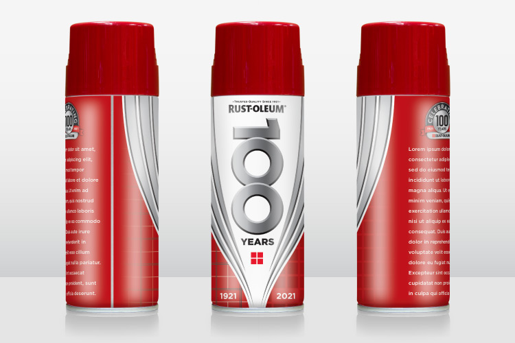
Mockups
3d mockups were created by photographing an existing spray can and then using Adobe Photoshop to add highlights, shadows, reflections, and to place in the label art from Adobe Illustrator. Views from various angles were created to show how the art placement would look as the can is rotated.
Label Design Iteration
Every icon was created from scratch for this label design, with each one representing a different item that Rust-Oleum paint is featured on. The idea for this would be to print the black directly onto the metal of the can, giving an interesting finish that truly pops with the bright and reflective nature of the bare metal.
Mockups
Once created, the same mockups were used for all can views and iterations. Care was taken to setup the files in such a way that the label art could be updated and new art placed by simply linking a new file rather than having to recreate a new mockup entirely.
Pure Cleaner
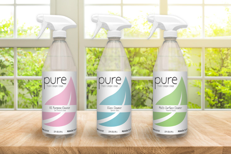
Project Overview
A new line of cleaners for Rust-Oleum, Pure, needed branding and artwork created for a series of spray bottles. Label art was created for the series, as well as digital mockups to display how the final products would look.
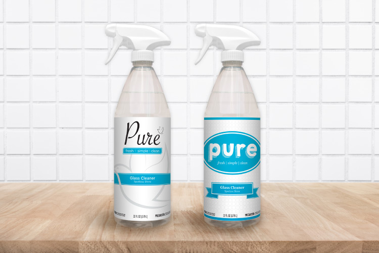
Mockups
Photographed existing spray bottles and edited with Adobe Photoshop to display newly-created flat art in a more engaging and visually appealing 3d render.
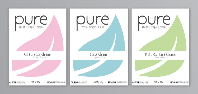
Label Art
With no existing branding, a style was developed to match the client's vision for the products. Changes to certain copy and colors show how the overall design would adapt to a series of products.
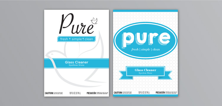
Iterations
Various design and typography options were created before settling upon the final version.
Brochures
Project Overview
Created a number of trade and consumer-oriented brochures for Rust-Oleum brands that can be found in major retailers including Home Depot, Lowes, Menards, and more. Projects included designing the overall styling as well as laying out the spreads, which ranged from several pages to several dozen.
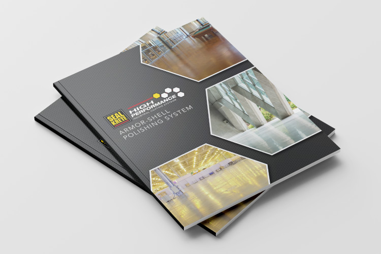
Design
Shown is one example of a brochure for Seal Krete, a subsidiary of Rust-Oleum. The design plays off of existing Seal Krete branding to create its own design that still fits with the brand's overall styling.
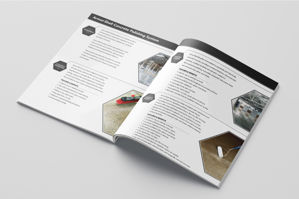
Layout
Designed layout for the inside of the brochure, balancing style with function and ensuring information and imagery flowed logically while fitting within alloted space.
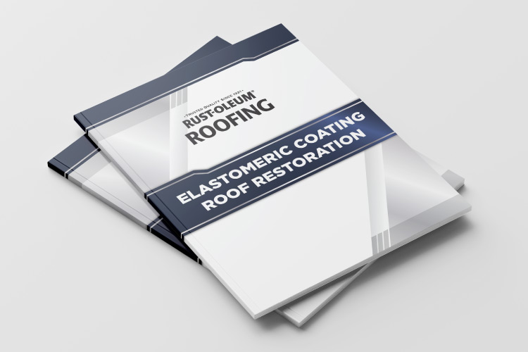
Design
This informational catalog for Rust-Oleum roofing was given its own design created from scratch. Along with the cover, several dozen inside pages were designed in a consistent style. Additionally, several hundred already-existing informational pages were organized and placed in the correct order throughout the catalog.
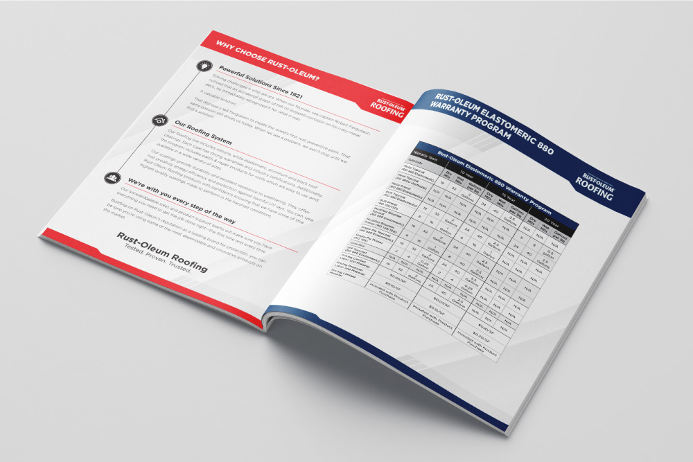
Layout
Each inside page featured unique content that needed to be layed out in a consistent manner and design. These included copy-only spreads, informational charts, product displays, photo and text instructionals, etc.
Vintage Can Posters
Project Overview
Created a series of posters for display within Rust-Oleum's corporate headquarters showing off vintage can designs throughout the ages.
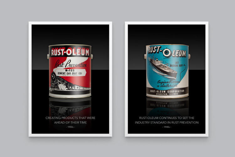
Photography
Carefully wrapped vintage flat label art onto blank cans—ensuring uniformity in size, placement, angle, lighting, and more between images. Photographed dozens of cans, in quart, gallon, and spray sizes for various posters.
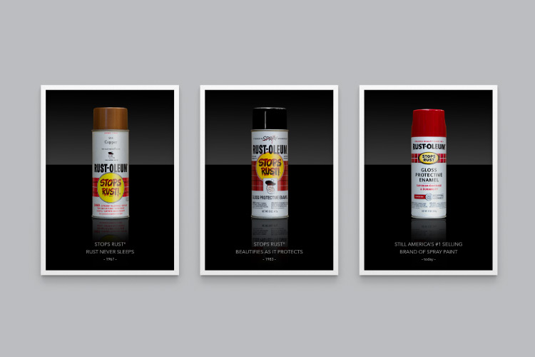
Editing
With vintage labels came signs of age that were digitally edited out to breath new life into the images. Reflections were added and all were made into posters which now hang proudly in Rust-Oleum's corporate headquarters.
©2020 Izzy Burlini